Small Lettering Guide – Part 2
Short and Wide or Sharp Corners

Wide fonts (also known as extended) and fonts with sharp corners are much more difficult to come out nice in embroidery. On corners, both the horizontal and the vertical strokes have more chance of being uneven. This is due to the need for shorter stitches in the corners. Also, it is more difficult to keep horizontal strokes looking straight when they reach the corners.
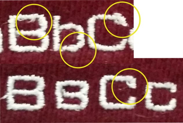
Curved areas in extended fonts generally do not look good. The inside of these areas have too many short stitches and the curve tends to be too sharp to sufficiently cover some underlay.
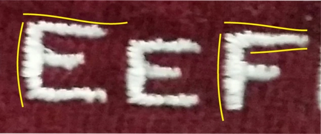
Extended letters are wider, so the horizontal strokes tend to appear to be more wavey and irregular.
Condensed Fonts
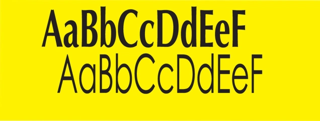
When a font is narrow (also known as condensed), the problem areas many. You may have issues between letters and in the negative spaces (see page…) Condensed fonts are more likely to have narrow strokes or columns thus limiting the chance for proper underlay.
When using condensed fonts, try to use actual fonts labeled condensed rather than squishing the font manually. You will just end up with narrow vertical strokes, and less space between letters.
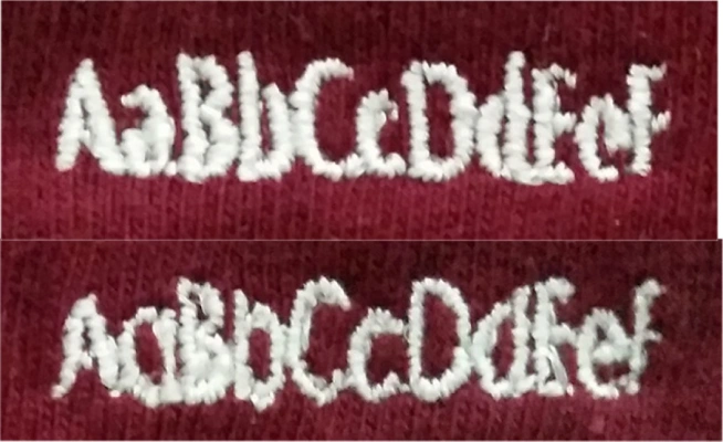
Condensed fonts work better on twill and nylon since these fabrics do not have a need for much underlay. Conversely, they do not work well on fabrics such as polar fleece, knits and sweats.
Run-stitch Letters
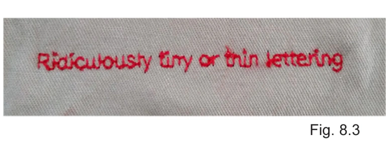
Most letters are made in a satin stitch (tight zig-zag), but these have limitations in how small you can really get. The shorter the letters, the less room you have for each stitch making for uneven and rough letters.
The best alternative for extremely small letters (around 1/8” high) is using a continuous run stitch. This is a run stitch that does not trim between the letters of the word, but always has a jump stitch. This isn’t the most ideal approach, but when a customer has to have that incredibly small line of text, this is an option.
Serifs
Serifs are little “feet” that are on letters such as Times Roman and the font used in this paragraph. It can be difficult to make serifs come out clean on really small letters. They can look uneven, distorted from the fabric, or just plain crowded.
Serifs tend to look best on twill and nylon type fabrics. These fabrics don’t sink and rarely cause the letters to move around.
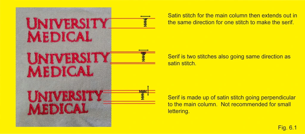
There are three different ways to digitize serifs for small lettering: The first is making the serif go 1 stitch out from the column (fig. 6.1 for all 3 examples.) The second is the same direction but 2 stitches form the serif. The third version, the serifs have a satin stitch that goes in the opposite direction as the column. This means most of the serifs will then have a stitch that goes vertical which is the same direction as the weave of the garment. The serifs are likely to sink into the weave and also will have more width to them causing them to merge with adjacent serifs.
For this reason it is recommended to stay away from the 3rd type for small lettering (.25” or smaller) especially on knits, polos and tees.
Taglines and URLs
It is always beneficial to notice when a logo is problematic before you get it embroidered. Sometimes you can prevent a frustrating experience for you and your customer simply by being proactive. So be sure to look over the logo and talk to your customer.
You can’t always fit everything you want in embroidery. There are size constraints due to location, type of fabric and just the fact we are dealing with thread and not ink.
Take taglines for example. Taglines are the little saying that generally goes below the main logo. Taglines need to not overpower the logo they belong to, so they are generally really small, often too small for embroidery. There are some ways to adjust the art so the tagline will embroider cleanly.
In fig 7.1 we can see several ways of tackling a small tagline. The simplest is removing the tagline. It keeps the logo clean. Since that is not always an option for your client, try moving the tagline into an area of the logo which allows it to have more space to be enlarge. Another is splitting the tagline and stacking it into two lines.

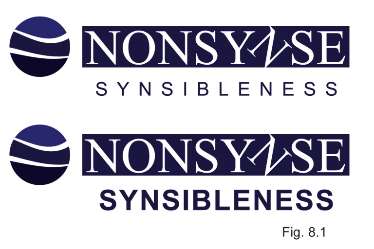
Another way is reducing extra space between the letters. Simply by moving letters closer together, you can expand the amount of space you can then enlarge tagline (fig. 8.1)
One such way is changing the font. Serifs and extended fonts take up more room. Try changing serifs to san-serifs and extended fonts to regular or even condensed.
Website Urls can be helped simply by removing unnecessary information. You don’t have to type in the http://www. part for it to work, so why bother with it? Plus is more streamline and cleaner to shorten it (fig. 8.2.) The shorter it is, the more areas it can fit into such as women’s sleeves.

The size difference can be staggering, when you eliminate non essential parts such as “https://www.” The letters will not only be cleaner, but for advertisement, it only makes sense to make it larger.
Negative Space

The square on the left shows an e in black. The e is what we know of as the positive space. The square on the right shows the gray area surrounding the e and the orange area showing the enclosed space of the e. Both of these are negative space.
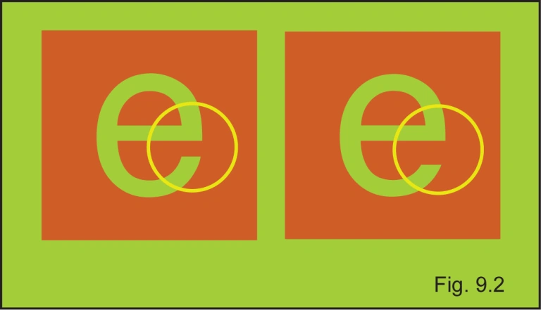 The negative space in the e on the left show a narrow space between the end of the e and the horizontal stroke. In embroidery, this space is going to fill up easily. On the right is an e that will embroider nicely.
Negative space is the area around or trapped inside a shape. When dealing with small lettering in embroidery it is the negative space areas that can cause the most problems. This guide will show you what to look out for.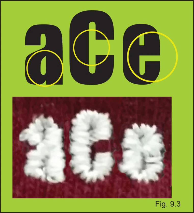
Any enclosed space or area between letters are all negative space. Look for areas that seem close together, because if they look too close in print, they will definitely look too close in embroidery. Embroidery has a habit of filling up small areas when going around in a satin stitch (fig 8.2.)
A good example of nice bold letters, but with small negative space. As you can see, the e and the a nearly close up entirely.
In Summary
Use the guide to help you determine if your logo will work.
The minimums are just that, minimums. Generally, the larger and bolder the better.
If letters are small, first ask your customer if they are okay with you stacking the letters or enlarging or changing the font to allow for larger cleaner letters.
Tackdown can help clear the field when using heavy pile fabrics such as towels or polar fleece.
Water soluble topping can help with fabrics such as heavy knits and even pique.
Condensed or square fonts will look more distorted when small.
Crowded letters are problematic. If letters are too close, the stitching of each letter can influence and distort adjacent letters.
Conversely, too much space will determine if we have to trim. The more trims, the more problem areas. Each time there is a trim, it involves lock stitches before the trim and tie-ins at the beginning of the next letter. The smaller or thinner the letter, the more noticeable the lock stitches will be.
Extra space between letters can be utilized to enlarge the words and therefore get better looking letters. Drop unnecessary parts like “www.”
Serifs are difficult in really small lettering. A serif font may need to be changed to something San Serif such as Myriad or Helvetica to come out clean. Thicker is not always better with serifs.
Learning about negative space can help you notice possible problem areas in a design. If the hole in a lower case “e” looks small when printed, it will be even smaller when embroidered.
Have any questions? Contact us:
service@ignitiondrawing.com 253-284-0733 ignitiondrawing.com

0 comments on article "Small Lettering Guide – Part 2"