
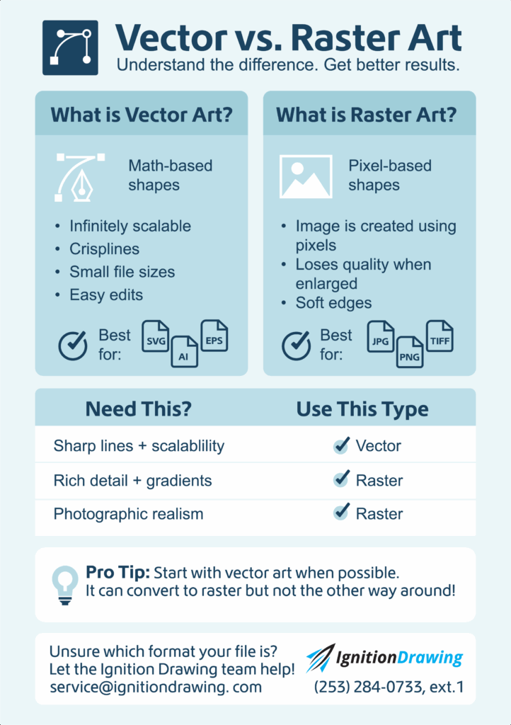
Vector vs. Raster Art
What Every Customer Should Know for Better Print Results
At Ignition Drawing, we believe that great artwork begins with understanding the foundations. Whether you’re designing for embroidery, screen printing, or digital decoration, knowing the difference between vector and raster art is essential. These two image types serve different purposes, and choosing the right one can be the difference between crisp, clean results and disappointing output. Let’s break it down together—no jargon, just practical guidance.
What Is Vector Art (and Why It Matters)?
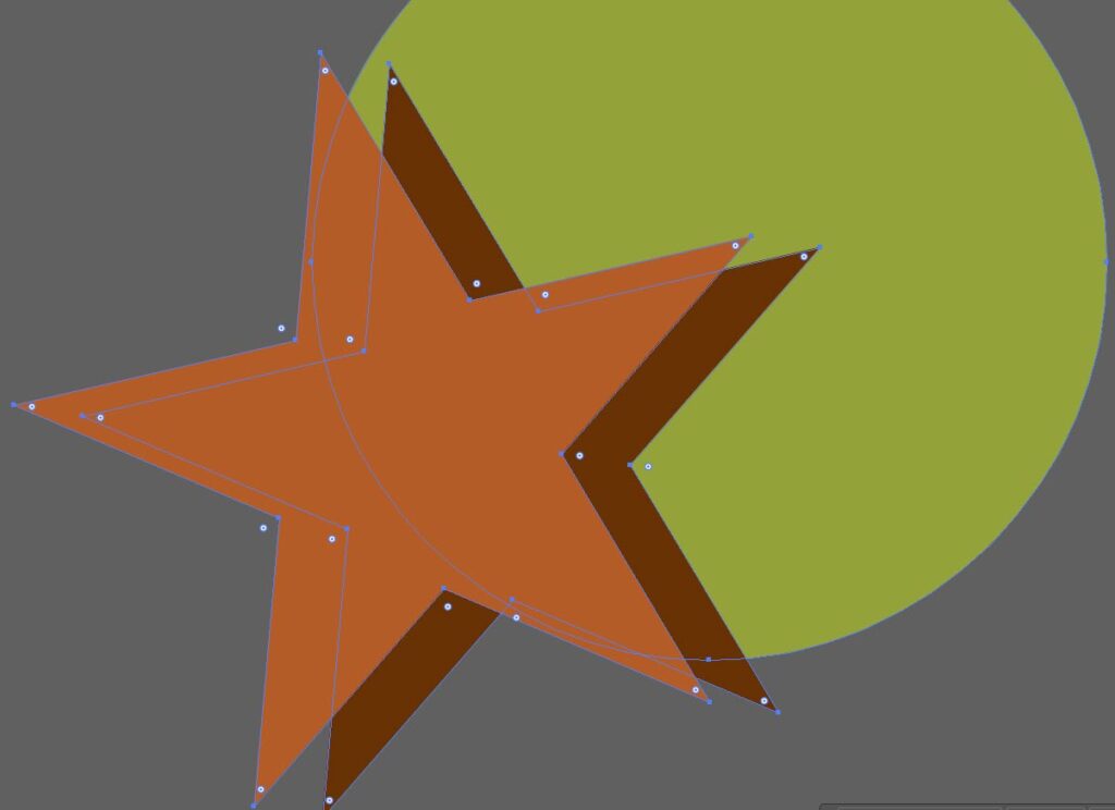
Think of vector art as a blueprint. It’s created with lines, curves, and shapes defined by mathematical equations—not pixels. That means your design can be stretched across a billboard or shrunk down for a business card without losing a single ounce of quality.
Why Use Vector?
- Scalability: No matter the size, your art stays sharp.
- Editability: Need to tweak a shape or change a color? Easy with software such as Corel Draw or Adobe Illustrator.
- Lightweight: Often smaller file sizes, especially for simple designs.
- Typographic Precision: Text remains clean and legible at any size.
Best Uses:
- Logos and branding elements
- Icons and simplified illustrations
- Text-based layouts
- Diagrams or line drawings
- Any artwork that might be resized for various print applications
Common Formats:
SVG, AI, EPS, PDF
What Is Raster Art?
Raster art (also called bitmap) is made of a grid of individual pixels. Every tiny square carries color information, which makes raster great for detailed images—but not so great when it comes to enlarging.
When should I use Raster?
- Photorealism: Perfect for photos and complex artwork.
- Textural Depth: Ideal for gradients, shading, and visual richness.
- Complex Imagery: Great for artwork that mimics the real world.
Be Aware:
Scaling up can lead to a blurry or pixelated image and increase the file size.

Best Uses:
Photography
Digital painting or artwork with gradients
Detailed textures (e.g., for apparel or environmental design)
Web-based visuals
Common Formats:
JPG, PNG, GIF, TIFF, BMP
Which Should You Choose?
Here’s a quick cheat sheet:
Use Vector If You Need…
✅ Clean, scalable logos
✅ Sharp illustrations or graphics
✅ Editable artwork with separate elements
✅ Text-heavy designs that remain crisp
If You Need…
Use Raster if You Need…
✅ Realistic photographs
✅ Complex textures and shading
✅ Visual richness with subtle color transitions
Pro Tip from Ignition Drawing:
While vector art can be converted to raster (e.g., for printing or screen use), raster art cannot be seamlessly turned into vector. That’s why starting with vector—especially for logos and illustrations—is usually the smarter move.
Let’s Get It Right Together:
At Ignition Drawing, we work with both raster and vector files every day, and we’re here to make sure your artwork looks perfect—on screen and in print. If you’re unsure which format is best for your project, just ask. Our team of seasoned digitizers and vector professionals is always ready to help you make the best choice.
Use this Vector vs. Raster Art Cheat Sheet for Your Next Project:
Have a question about your file type? Let’s talk—because the right format makes all the difference.
IGNITION DRAWING
VECTOR CUSTOMER SERVICE
Phone: 253 284 0733 Ext. 1
Email: service@ignitiondrawing.com
0 comments on article "Vector vs. Raster Art"