Optimizing AI-Generated Art for Vectorization
AI-generated art is a new, exciting, and innovative way to create stunning visuals, but it does come with its challenges, especially when preparing it for vectorization. Our vector drawing specialists are trained to recreate exactly what is provided.
If you’d like us to convert your AI artwork into a clean, scalable vector drawings, here are a few key things to review before sending it our way.
✅ Check for Spelling and Gibberish
AI can sometimes generate misspelled or nonsensical text. Review any words in your artwork to ensure accuracy in your art.
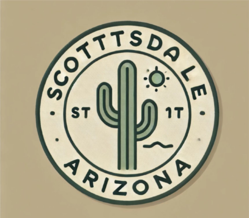
In this design, “Scottsdale” is misspelled, the sun is smudged, there are extraneous letters next to the cactus, and there are extra dots in the ring.
Suggested edits:
-Remove a “t” in Scottsdale and recenter the text
-Remove the stray letters “ST” and “IT” near the cactus
-Clean up the sun to remove any smearing or blurring
-Delete the two dots on either side of “Arizona”
✅ Unwanted Repetitions
AI has a habit of duplicating words or elements unintentionally. Make sure there are no redundant phrases or elements you don’t want to appear in your updated art. Be precise and clear on what you want done with that empty space after you remove images or text. Consider: will the removal present a hole in the design, or cut off an image, or is there a line that you need to have reconnected?
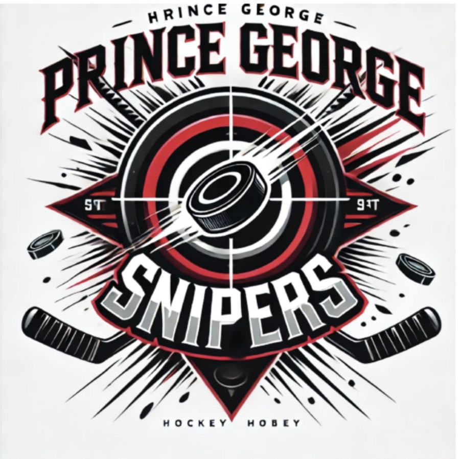
At first glance, this artwork looks fine, but the name is repeated, and there are text elements that don’t belong.
Suggested edits:
-Remove the white letters in the side triangles next to the puck
-Remove “Hockey Hobey” from the bottom
-Remove smaller “Prince George” and surrounding dashes at the top
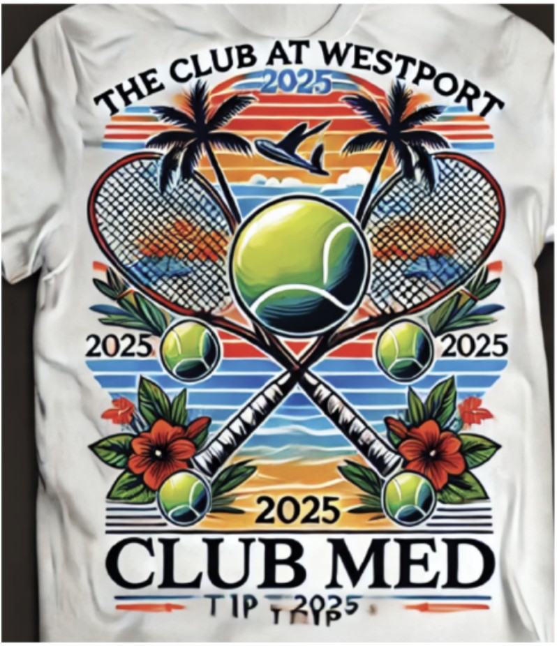
Here’s another design with duplicate text, misplaced decorative lines, and visual clutter behind key graphics.
Suggested edits:
-Keep only the “2025” above “Club Med”; remove all other instances
-Delete the curved orange and blue lines under “The Club at Westport”
-Remove the text below “Club Med” and make the blue and orange single, continuous horizontal lines
-Refine the lines in the racket
-Remove the blurry images behind the racket
✅ Watch for Extra Dots and Texture
Tiny, unnecessary details like scattered dots or ornate filigree can make vectorization more complex. Let us know how you want these elements treated.
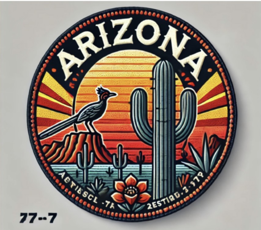
This design has issues with inconsistent red dots around the circle. The artwork has speckles that could cost more to duplicate.
Suggested edits:
-Replace the lumpy red dots in the outer ring with evenly spaced, solid red circles (no highlights)
-Remove speckling in the design
-Delete the white text at the bottom and the red dots below “Arizona”
-Remove “77–7” and eliminate the gray background
-Ensure the design uses solid color fills, no patterns or gradients
✅ Missing or Blurred Areas
AI-generated art sometimes produces smudged, blurred, or incomplete details. It’s important to identify any parts that need clarification before vectorizing. Include specific examples if needed.
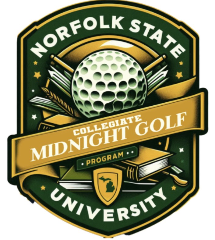
In this design, structural elements like the black border and key details inside the logo need refinement.
Suggested edits:
-Complete the black border around the entire logo
-Delete the two white lines to the right of the shield
-Separate the overlapping circles in the golf ball above the “GI” in the word “Collegiate” and ensure they are distinct and round
To recap:
- Check for misspellings
- Look for unnecessary repeated elements
- Simplify texture and dots for lower cost
- Note any unfinished objects or details that need to be fixed or removed
Following these steps will help ensure you receive your vector drawing exactly as you envision it, quickly and efficiently.
Reach out to the Ignition Drawing team anytime at vector@ignitiondrawing.com. We are here to help.
0 comments on article "Optimizing AI-Generated Art for Vectorization"