
Working With Monitor Coloration
“Why Can’t You Match The Original Colors?”
This is a question we get every now and then. We always strive to match colors as close as we can, but a few factors make it impossible to match 100%. One such reason is that each monitor displays colors differently.
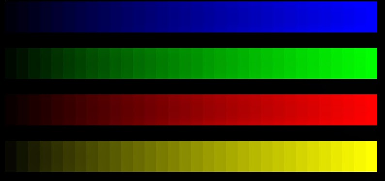
Try looking at the above image on 2 different monitors
If you don’t have 2 monitors, next time you’re in a department store, look at the rows of display screens they have and observe down the line how different the display is on each one.
Even between the same monitor brand and model, color modes and file format can create dramatic differences. Such as this noticeable change from RGB (a color setting to make colors pop on screen) to CMYK (a color setting to match more closely to what a printer can offer):
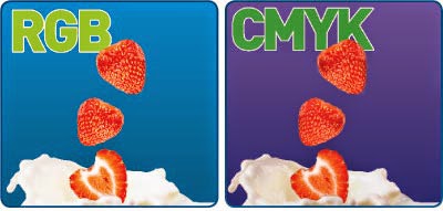
Programs translate Bright Blue in RGB to purple in CMYK.
Another reason for color variance is the fact that vector uses mathematical shapes instead of pixels to make up an image (see our vector blog for more info). This means that blending can’t be done the same way in vector that it can be done in a bitmap image.
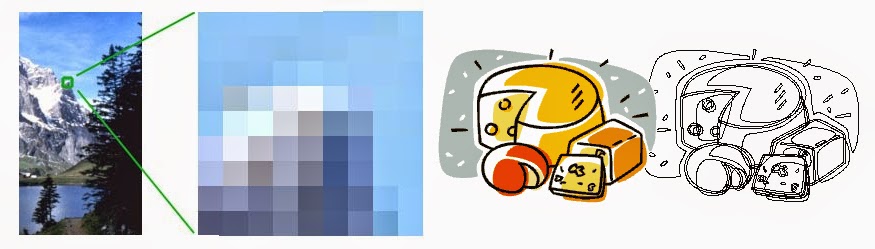
A bitmap (left) is made up of thousands of pixels on a grid. A vector (right) is made up of shapes that are colored in, preventing photo realistic blending but allowing re-sizing.
Can Anything Solve The Color Issue?
For the best result on a monitor, make sure your monitor is calibrated in 24-bit or higher color mode, and adjust the Contrast and Brightness. Monitors often cast a blue tint on the screen when they’re new, which isn’t easy to notice since our brain adjusts to it.
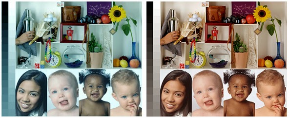
Before and After Monitor Calibration
To get the most accurate colors for print from our artwork, use Spot Colors, and invest in a Pantone Formula Guide. (Click here to find one). Be aware though that onscreen colors will vary from what is found in the book, but rest assured if you specify the exact color, it will match what is found in the book regardless of onscreen colors.
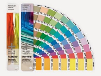
We advise all our customers to pick one of these up!
For more information contact us!
service@ignitiondrawing.com 253-284-0733 ignitiondrawing.com
0 comments on article "Working With Monitor Coloration"