banner
User Icon Jesse Elliott
/ Categories: The Basics
0
  Print

The Art of the Dot: Why Halftones Matter More Than You Think

Ever wonder how printers achieve smooth gradients and realistic shading using only one ink color? The secret lies in halftones — the tiny dot patterns that turn solid ink into subtle tonal variations.

What are Halftones?

Halftones are dot patterns used to simulate tonal variation with a single ink color. By varying dot size and frequency, halftones create the perception of gradients and shading. Smaller dots produce lighter values, while larger or more closely spaced dots yield darker values. This method allows printers to reproduce a wide range of tonal values without adding additional spot colors or increasing the number of screen separations.

Why You Should Create the Halftones

When we deliver artwork, we provide clean color values but do not create the halftone dot patterns. That’s because halftone structure is dependent on multiple variables that differ from printer to printer: mesh count, ink type, screen tension, substrate, and press setup all play a role in determining the optimal dot size and frequency.

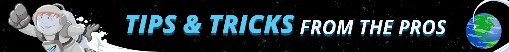
If we create vector halftones, it would be difficult for us to create the size of halftones you want and as shown on the right, the dots will be vector shapes and won’t be editable.

Instead, halftones should be generated at the production stage using RIP (Raster Image Processor) software. The RIP applies halftone settings based on the printer’s specific requirements, ensuring consistent dots-per-inch (DPI), angle, and shape. If halftones were embedded into the artwork, any change in mesh count or screen size would require manual reprocessing—adding unnecessary time and cost. By leaving halftone generation to the RIP, you maintain flexibility, precision, and production efficiency.

Seeing Drop Off? Might Be Your Dots are Too Small.

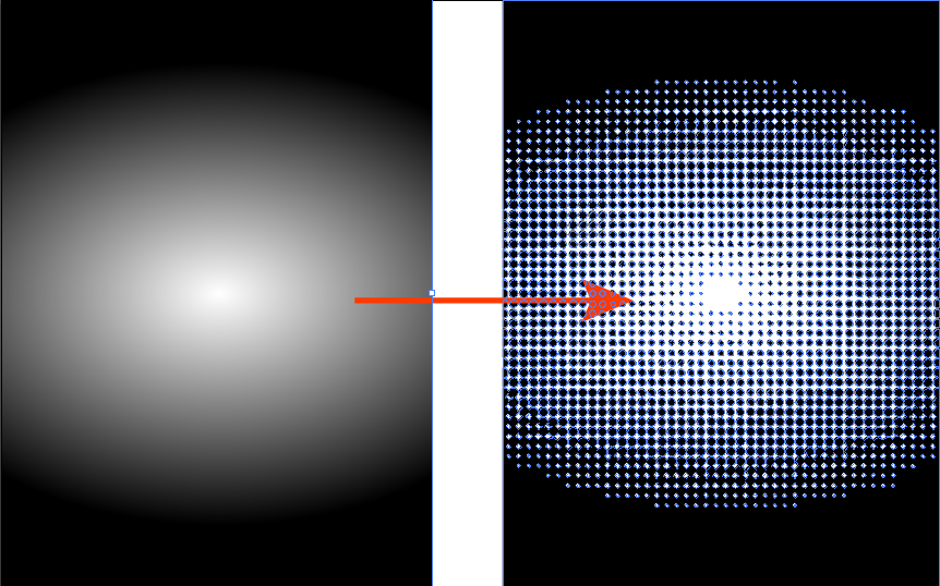
When screen printing, drop off can happen if the dots are too small. The top strip is the artwork, the middle strip is what it may look like printed if the halftone is too small. The bottom shows a larger halftone with a more even gradient.

By being able to change the angle and dot size not only prevents loss of halftone but can also help prevent what is known as a Moire pattern. Compare the image on the left that has a Moire pattern with the image on the right. The angle has been changed the dot pattern enlarged.

Halftones may be tiny, but their impact is huge. Each dot works in harmony with countless others to bring your artwork to life. By trusting your printer to set them up correctly, you’re not giving up control — you’re collaborating for the best possible result on press.

Previous Article Winners of our First Ever Digitize & Win contest!
  Rate this article:

0 / 5. 0

0 comments on article "The Art of the Dot: Why Halftones Matter More Than You Think"

Leave a comment

Your email address will not be published. Required fields are marked *

*

The Art of the Dot: Why Halftones Matter More Than You Think

Ever wonder how printers achieve smooth gradients and realistic shading using only one ink color? The secret lies in halftones — the tiny dot patterns that turn solid ink into subtle tonal variations. What are Halftones? Halftones are dot patterns used to simulate tonal variation with a single ink color. By varying dot size and […]

Continue Reading →

Winners of our First Ever Digitize & Win contest!

We’re excited to share the 1st place winner of “Digitize & Win” and it’s easy to see why this design stood out. You no like, you no eat! This embroidered portrait of two gentlemen in their formal best came out beautifully. The suits have great blended detailing that adds nice depth, the faces are clean […]

Continue Reading →

Preparing for the Job: Get Cleaner Embroidery Sew Outs Every Time

Have you ever noticed that your embroidery sew outs on backing material look rough, fuzzy or feathered? This happens because embroidery backing doesn’t have a weave or grain to hold stitches in place. Without this structure, needlepoints shift into nearby holes and bunch up, leaving even the best underlay looking uneven and messy. That’s why […]

Continue Reading →

Vector vs. Raster Art

What Every Customer Should Know for Better Print Results At Ignition Drawing, we believe that great artwork begins with understanding the foundations. Whether you’re designing for embroidery, screen printing, or digital decoration, knowing the difference between vector and raster art is essential. These two image types serve different purposes, and choosing the right one can […]

Continue Reading →

How to Prevent Puckering in Fabrics

Puckering can ruin an otherwise perfect embroidery. Here’s how to avoid it, especially with tricky fabrics like performance wear. 1. Manage Satin Stitches Wide satin stitches (over 4 mm) often cause puckering, especially on stretchy fabrics. Keep stitches under 4 mm to avoid pulling the fabric. The wider the satin stitch, the more likely the […]

Continue Reading →

What fabric type should I choose for my order?

When placing an order for digitizing embroidery, one of the most common questions is, “What fabric type should I choose?” This decision is crucial as it impacts the quality and precision of the embroidery. Understanding the fabric type you will be working with helps us tailor the digitizing process to ensure the best possible results.  […]

Continue Reading →

Transform Your Apparel with Distress Overlays in DTF Printing

Direct to Film Transfers (DTF) What is distress, and how is it utilized in DTF printing? Distress is a design technique where deliberate imperfections are added to the artwork digitally before printing. This overlay reduces the amount of ink deposited, resulting in a softer feel on the garment and allowing for greater flexibility and breathability […]

Continue Reading →
123456